"Typographic hierarchy" is how different faces, weights, and sizes of typefaces structure a document. Use appropriate line height, scale, (generally defined by CSS) include such things as section headings, entry headings, navigation and tertiary headings, all other heading elements, body copy and leading, button and field size and styles.
Clean UI Design
Consistency in actions
Use Clear Terminology
Use terms that make sense to users, use positive feedback to show what has been accomplished and where in a process that the user rests.
- Use subheads
- Use numbered or bulleted lists
- Highlight keywords
- Use short paragraphs
- Consider the inverted pyramid of the most important text at the top
- Feature a simple writing style
- Markup font sizes in relative terms, not as an absolute number of pixels or fixed sizes
- Label images with "alt"
Actions
Buttons are a call to action; they should be larger and be differentiated in text and background or look dimensional.
Logical tabbing order, active, focus, and all states should be used (hover, etc.) for every button with brief informative text.
Touch Targets, Buttons, Gestures
Vertical, small screens, targets
Padding, line spacing, leading should be used to a pleasing consistent visual standard to make it easy to select the right buttons to read text and process indicators without difficulty.
Disable buttons that cannot be used, use shadows behind active choices to indicate modal windows.
Text links are difficult to see on mobile, so the most efficient links tend to be buttons, and as possible larger. Anything that takes the user somewhere unexpectedly the user should be notified first.
Touch targets
- Be aware of size and placement
- Tappability signifiers
- Accidental gestures and taps, and the ability to undo actions
- Flat design is popular but skeuomorphism is coming back into style as neumorphism (large flat colors and white)
- An example of some lovely neumorphic designs: https://medium.muz.li/skeuomorphism-neumorphism-ui-trend-e7b78792bd21
- Use the same styles and techniques throughout the app.
Gestures
- Horizontal swipe: swipe-to-delete, swipe-to-turn-page
- Vertical swipe
- Be aware of gesture ambiguity - how can a user reverse a choice?
- Tapping and content
- Animation to show where to go or what to do next in processes
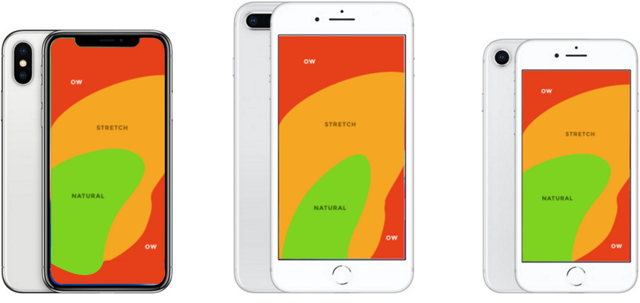
As the size of mobile phones have increased the corresponding single hand reach has decreased.
Designing apps for one-handed use means thinking about the area of human hands can reach – the natural reach of left and right-handers.
The overall shape is like a butterfly wing with space at the top being mostly unreachable while holding the device in one hand, either hand or both using the thumbs.
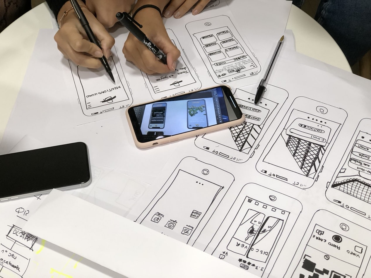
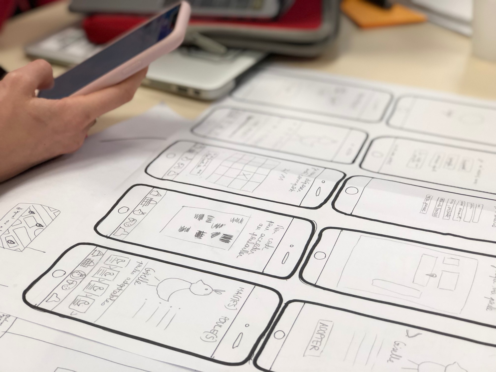
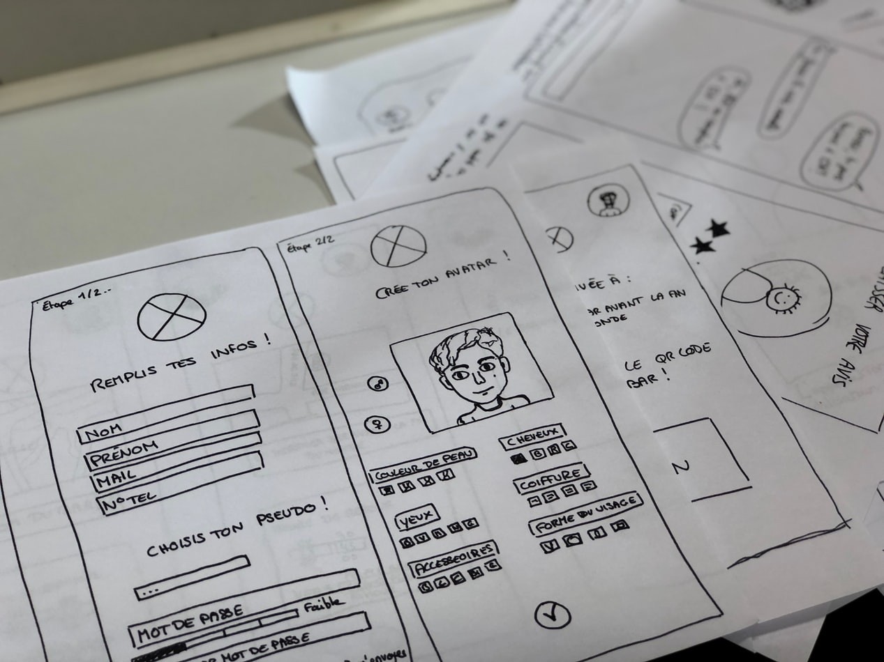
Forms
- Login and registration forms
- Workflow and form steps
- Submit buttons
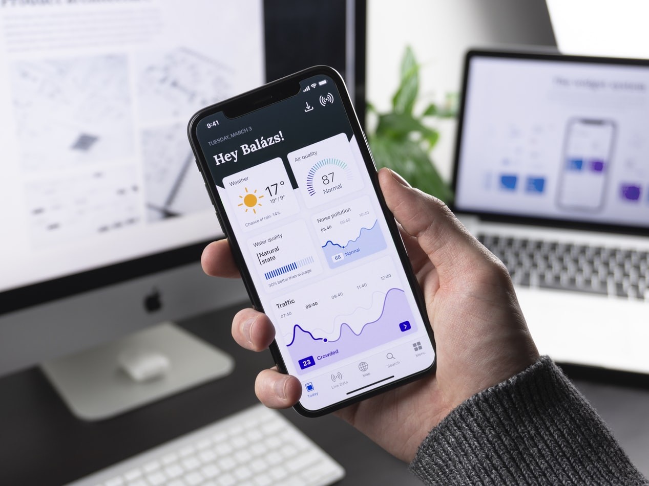
Chunking Information
On mobile, the smaller screens require content areas be divided into smaller chunks. Horizontal attention leans left, users read in an “F” shaped pattern on all screen sizes.
The content of interactions should also be framed within short and simple times, long and complex are difficult to do in smaller time frames users prefer and equally smaller interface.
Some apps are designed to perform quite complex tasks by thoughtful design, using more screens than a computer desktop screen would.
Content Blocks
Where a lot of visual elements are presented in small spaces the more subtle the elements design should be – the more space, the more refined lines.
Content blocks are a natural presentation style to smaller viewports of mobile.
The more text and information that needs to be displayed in the same area, the more refinement should be applied to how it is viewable in terms of small display changes, font faces, color, sizes, lines, spacing, color blocks, background, and link presentation - treating the text as UI, not just as “content”.
Visual weight should be considered when adding something, don’t be afraid to do something just a little bit different to get a point across.
Form Information
Collect information from passive sources of the user, if you know the name, location, address, phone number, email address, don't ask for it a second time.
Email addresses that have already been entered can remain in state, they should not need to be re-entered for a new password request.
Prioritize, discard, or offload less important collection of information to secondary pages
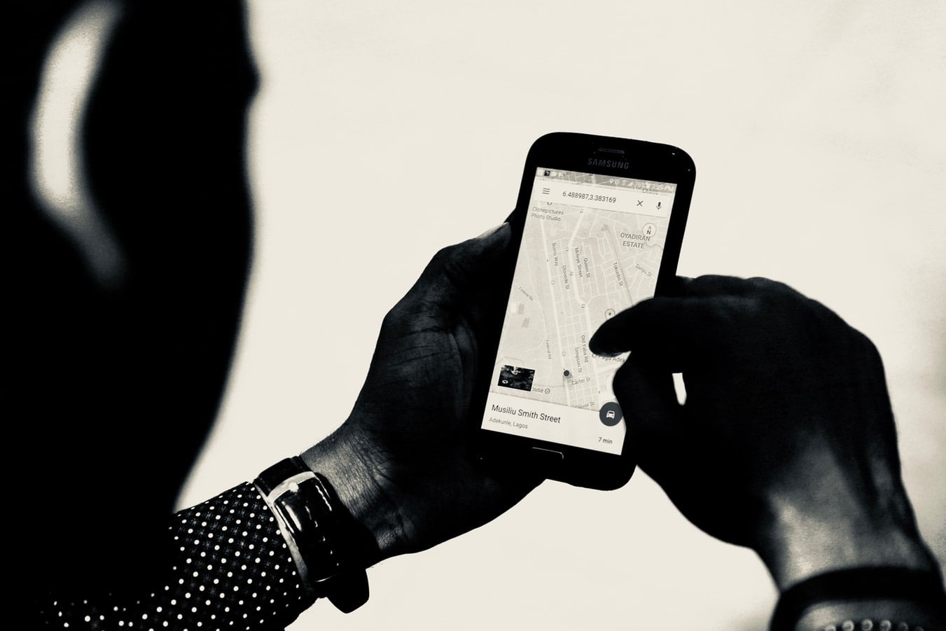
In addition to GPS, and direct phone there is the following functionality.
- Background audio
- Voice over IP
- Background location – apps are notified of location changes
- Push and local notifications
- Task completion extension – apps ask the system for more time to complete tasks
- Fast swapping - an app can be removed from memory any time
- Newstand – app downloads information in the background
- External / Bluetooth accessory to share data regularly
- Apps can update in the background, with low wi-fi use or cell network
Sometimes using classical lean typefaces, typographic hierarchy and spacing are all that is required for an interface design to be clean and effective.