Designing the best most useful and fun apps for mobile is best studied by doing it including testing.
Otherwise we produce terrible events that happen to someone else!
Using natural creativity pared with experience in UX design, what you discover about the users' needs will guide you to design for mobile successfully.
The first step in beginning a user-centered design process with a company, as a consultant, or a perm UX designer, is to collect the communication styles of the people you will be working with by asking them what communication methods they prefer and what times, time zones.
Other aspects of project communication, project management style, and process are specific to each organization, such as Waterfall or Agile or similar processes. Reporting on progress is an aspect of communication whether rolled up in email, part of agile, reported via Bootcamp, Excel, or Team and project software, etc.
A simple list of names, titles (roles), email addresses to include work and personal, phone numbers, their preferred styles, such as email or phone and when to contact, preferred meetings times, of each person is suggested. Team software often provides for these options.
A recent ad advertises a laptop that boots up as rapidly as 6 seconds, why 6 seconds? Researchers write that the human attention span may have become reduced to 6 seconds. So that is how long sites have to load and keep attention too. While 6 seconds may not be precise, speed is the desired requirement.
Generally, users have short attention spans, and to offer engaging applications and information if something isn’t really important don’t bother finding a way to display in a mobile app, or move it to secondary content or processes.
Pleasures of the larger screens are replaced by the portability of mobile.
Mobile is a vertical column instead of a horizontal user interface - there is a header, menu, content body, footer, with gestures common to the operating system.
Menu items and other content are made easier to consume by progressive disclosure – the art of providing more of related choices and content as the user consumes it.
Creating mobile apps means designing within a vertical orientation rather than the horizontal screen of computers. It’s not just a smaller screen size to consider, and the interface are touch interactions instead of a mouse; touch by tap, target size of a fingertip.
Speed is something everyone wants. Speed is the lifeblood of mobile; make designs load as swiftly as possible.
- Speed is an aspect both of the network speed and the memory used to load the front end and backend elements and respond to user requests.
- On the interface large flat single colors load faster than patterns. On the backend developers can optimize how displays load and function on the device side.
Research process
- Research & review users needs in software processes, documents
- Choose the best research options based on roles and document them
- Create plan and distribute to team members
- Document goals using keywords that define needs and wants
- Determine needs in UX and UI
- Meet with team members
- Agree on methods (such as Agile/Waterfall)
- Discuss process and progress
- Define needs determine processes and usability UX best practices for this particular design
Create a presentation of what we have learned and how specifically UI/UX standards can be applied to this mobile software
- Present findings
- Decide on next steps…
1# Understanding Users
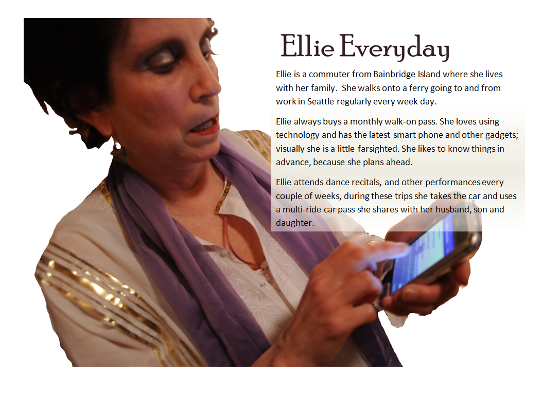
Personas and Scenarios
User Roles (profile) and
Personas to create walkthrough scenarios
- Who are the users?
- What scenarios (processes and actions under which conditions) do they need and want?
- Situational awareness
- Create role-based personas of system users to fulfill their needs…
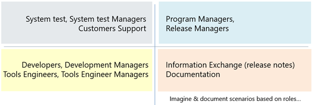
For example, for a software company, a support app may have the following stakeholders grouped together based on their similar needs:
Scenarios describe user personas “dream state,” which designers use to inform to-be-built features.
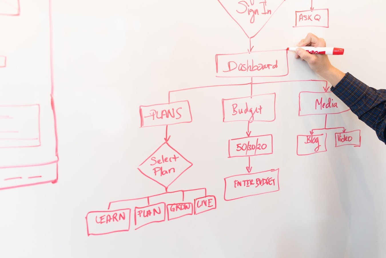
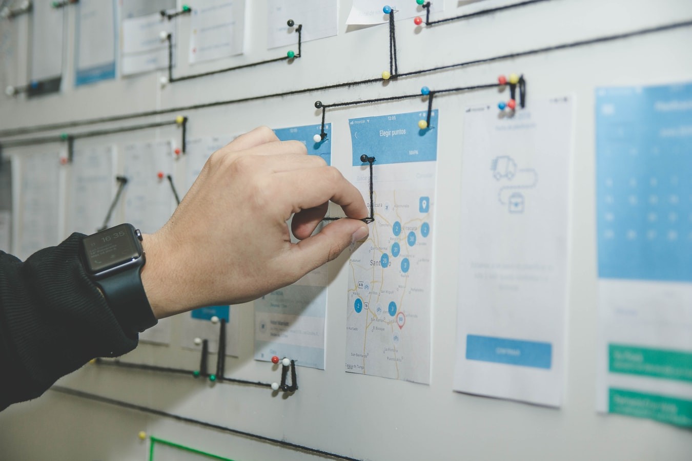
Processes and Workflow
Requirements Documents
- Process Design Specification + Implementation
- Technical + Functional Specification
- Design Guidelines
- UI Design Specification
- Design Patterns
- Interaction Specification
- Integration of UI and workflow (menu item) or process flow
User Interface and User Experience
- What will the interface do?
- How could it best do that?
Use and research best practices for usability and UX
- Simplicity
- Consistency - Logical grouping of fields
- Clear Search
- Use wizard processes
- Clean UI Design
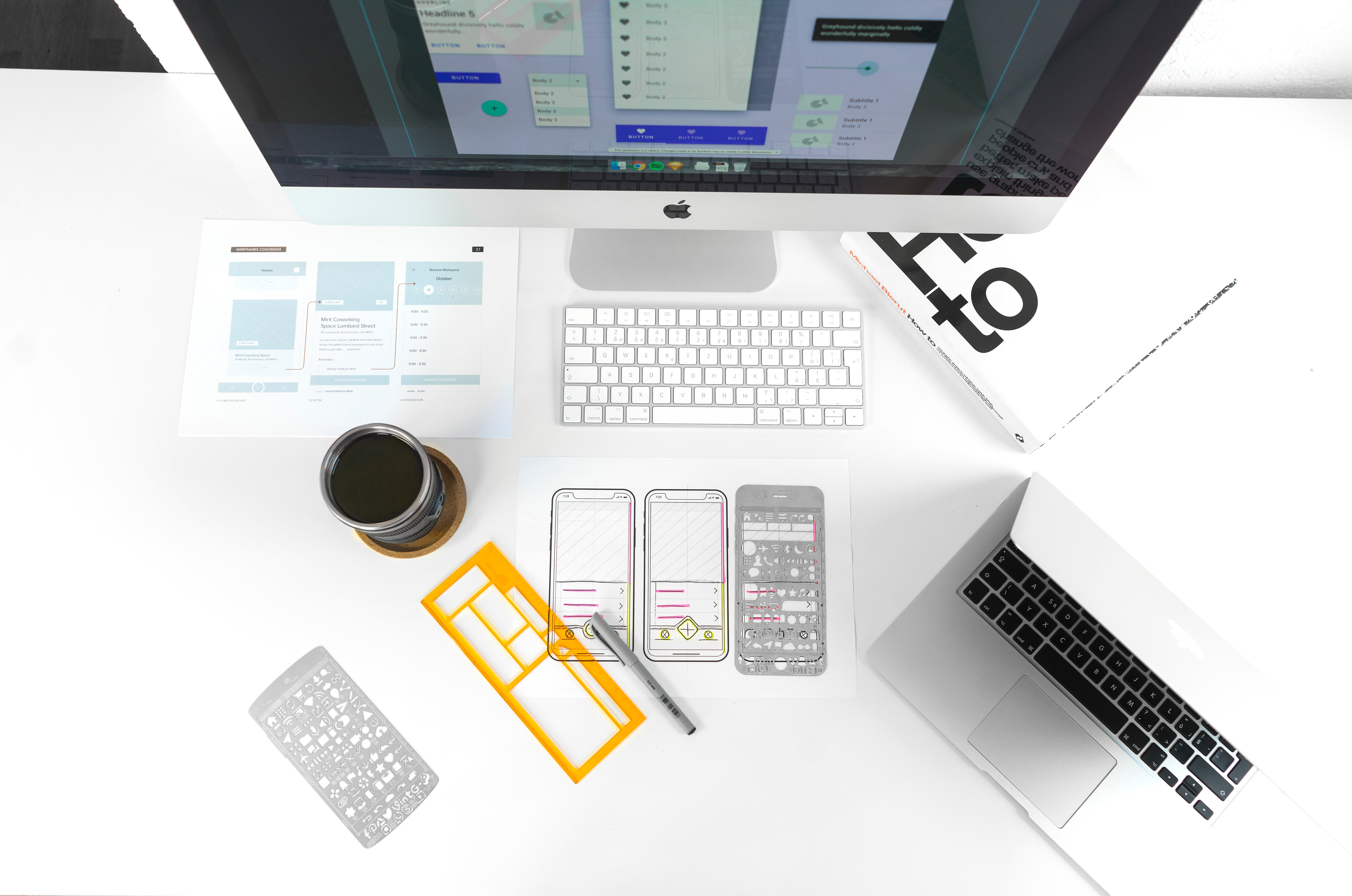
- Stay in low fidelity wireframes for as long as possible
- Use paper prototypes
- Use plain language with clear terms
- Typographic hierarchy
- Auto-save, append edits
- Increase Speed
- Test Early, Test often
Simplicity
"Keep it simple" - a primary goal of mobile application and site design.
Place the process, most important fields, and key information at top and to left or right; use the limited real estate effectively.
Streamline user interface and business processes.
Why simplicity?
Effective user interface design rests easy on the eyes.
If repeatedly used, such as in text or form fields user interfaces are generally created in various shades of gray, black, and white.
Use visual elements - shaped objects - on the screen to reinforce text and color variations used to promote usability
among color-blind users.
Display highlighted mandatory fields in yellow for example, with a physical indicator like an asterisk, bar, or text in the input field indicating it is required.
Use short and concise phrases. Use scannable layout – group like content, use multiple headings.
Use lots of white space, and enough space around selectable fields to enable 'fat fingers' to make intended selections.